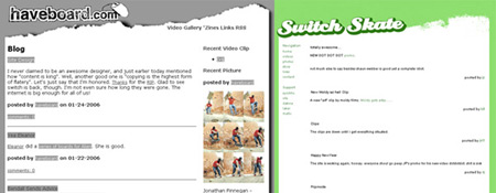
I never claimed to be an awesome designer, and just earlier today mentioned how “content is king”. Well, another good one is “copying is the highest form of flatery”. Let’s just say that I’m honored. Thanks for the RIP. Glad to see switch is back, though. I’m not even sure how long they were gone. The internet is big enough for all of us!


anyone hear about this: http://biz.yahoo.com/prnews/060124/phtu007a.html?.v=4
Like a cross between Haveboard & Hot Crew. I like the green.
design ain’t shit if people can’t access a website’s information. accessibility and useability. yadda yadda yadda.
Wait, Gonzo, what are you trying to say here?..
that youve been right all along and youre the man. happy?
cmon’ lookin’ good matters
You obviously missed the point I was trying to make, Nug.
the useability of a website should compliment it’s design. who gives a fuck if the website looks good if you can’t find what you are looking for? Take ‘nikeskateboarding.com’ for example. It looks great. All that flash is awesome, but if i wanted to find a specific pair of kicks, and show them to one of my friends i’m not going to send them to the nike site. i’m gonna send them to ebay where i can simply find a picture of the sneakers i wanted to show to my friend. That is why the new emerica site rules. emericaskate.com
Ahh the never-ending debate of useability vs. design. I’m gonna have to flip Gonzo’s quote and say who gives a fuck if your website is user friendly if it looks like shit? Some useful reading – http://www.cnn.com/2006/TECH/internet/01/17/canada.websites.reut/index.html That Emerica site is a good example of walking the line. It’s got a nice layout and it’s easy to find whatever your looking for. There’s too many sites out there that sacrifice design for useability and standards compliancy. Not that either of those things are bad, but without design…it’s just garbage. The opposite can also be said about too many sites worried about design and not useability. People need to learn to walk the line.
That long link is why you should let me write HTML code in here.
Dfiant, I’m the one saying that the design isn’t as important as the useability and accessibility. If the content is there, people will come. Take craigslist, for example. It is pretty much free of design. It is straight text, with alot of content. Content people want to read. Hell, you come here all the time. And you know I could really give two shits what the site LOOKS like (not entirely true, but for this conversation…) My point is, this site has visitors coming back regularly because people want to read what everyone has to say hear. I think it’s funny that one of my designs I actually made for this site got ripped. Unfortunately, boys will be boys, and I had to take out HTML from the comments.
looking good is part of functioning good. now spelling, that shit dont count.
I hope you weren’t comparing your site to craigslist. Craigslist can look like shit because it provides invaluable services that no other one site provides. But I’d be willing to bet the farm that if another site came along that provided the same exact services of craigslist but looked good…craigslist would either change their site or disappear after a short while.
A perfect example would be cars.com (which looks a lot better now than it did in the past) vs. vehix.com. Cars.com owned the online automobile market for years. Then Vehix came along with a good ad campaign and a slick website and took over the market in the span of about a year. Content may be king….but no one wants to look at shit. I do come here often, though I will say that when you had even less of a design than this and no comments, I wasn’t visiting nearly as much. As far as the HTML goes can’t you get an RTE or something? It’s just annoying not being able to put links or at least format my comment so that it doesn’t look like one big block of text. Nice statement Nugget, at least someone knows what’s up.
I swear your trying to get me to stop posting things on here. Limiting characters in the comment, no HTML, slim on the design.
You’re still here, you’re still posting…AND you DO have an ADMIN login…but that doesn’t work in the comments (yet). Craigslist:lot’s of content, slim on design/Haveboard:lot’s of content, slim on design. That was what I was comparing. Mr. Fiant, you know this site is my constant work in progress. And I agree, if haveboard had a BANGIN’ ASS design, it would be better. In other age old arguments, Dreamweaver SUCKS, My PC at work sucks, and Flash sucks! Pickin’ Scabs baby, pickin’ scabs!
Get use to the comment restrictions…it’s much better than NO commenting at all, right? I’ll work on some formatting workarounds for ya duder! I really am not trying to have an argument, as I agree with everything that everyone has said on this issue. But back on topic, the torn paper design that gonzo HATED got ripped….yea, that was my original point. I love things get so off topic.
Touche. (I think that’s how you spell it)
See above: “now spelling, that shit dont count.” – Nug
i’ll say it again — it’s all about accessibility, and sharing information. i didn’t get that when i was on the iframe tip a few years ago, and now that i do life is way better. I wasn’t saying that your site should look like shit, i said that the usability of your site should compliment the design. Simplicity goes a long way.